

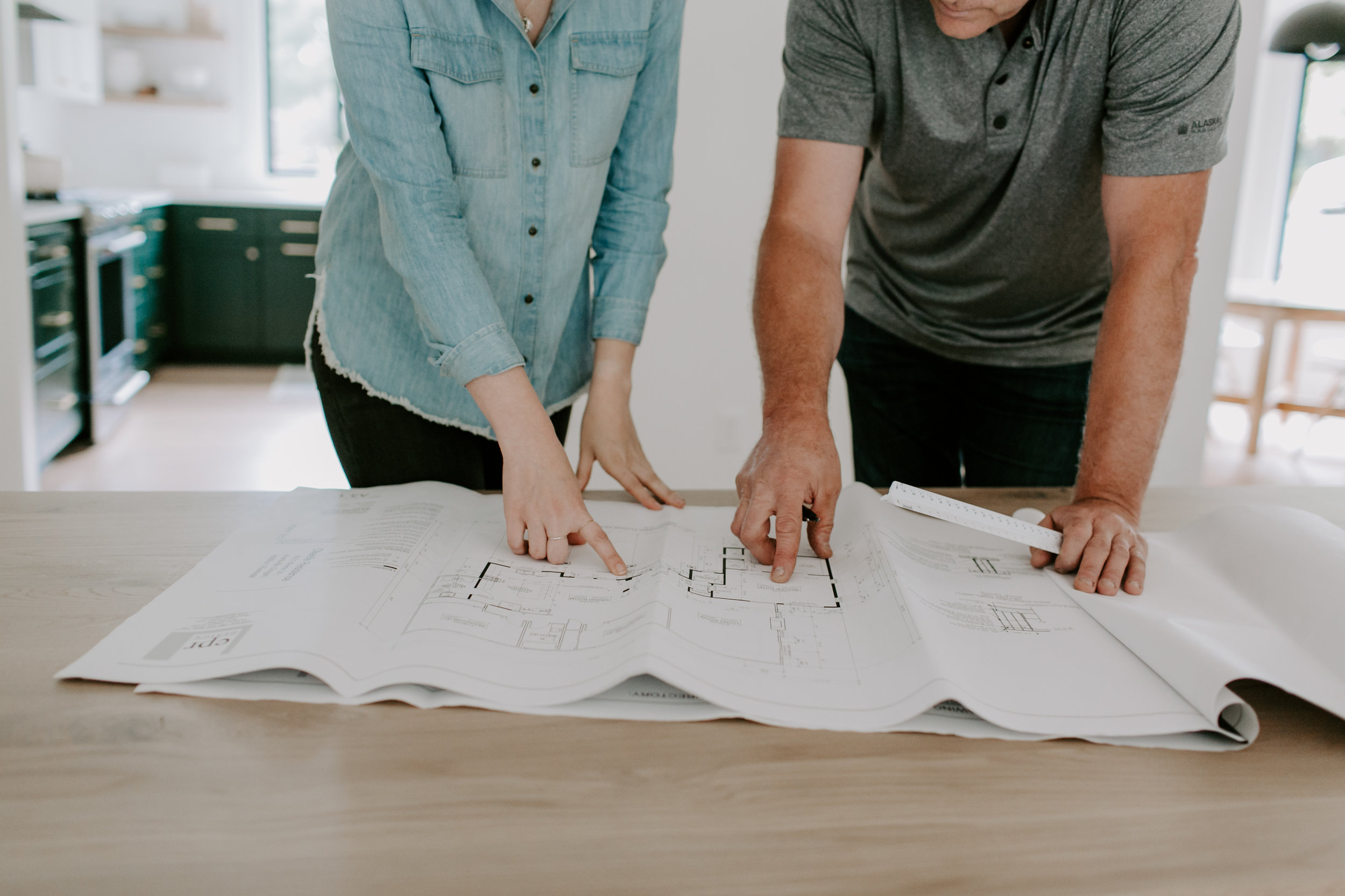
The journey of Calvert Court began with Patti listing the home which was sold to a family that knew they needed to make changes. This project began with a perfect example of how each branch of Williamson James works together. Patti, through the home sale was able to bridge the gap between purchase and remodel.
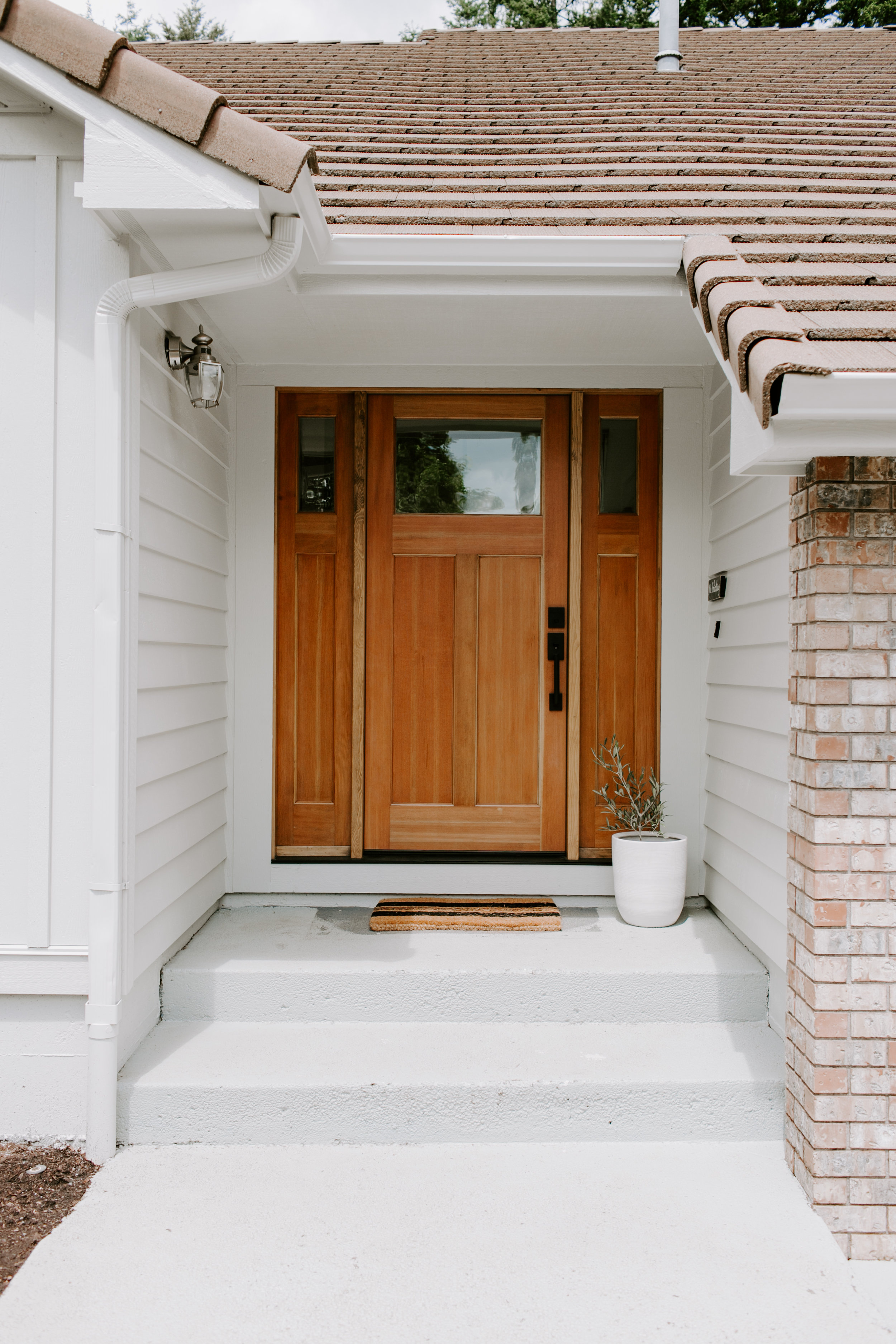

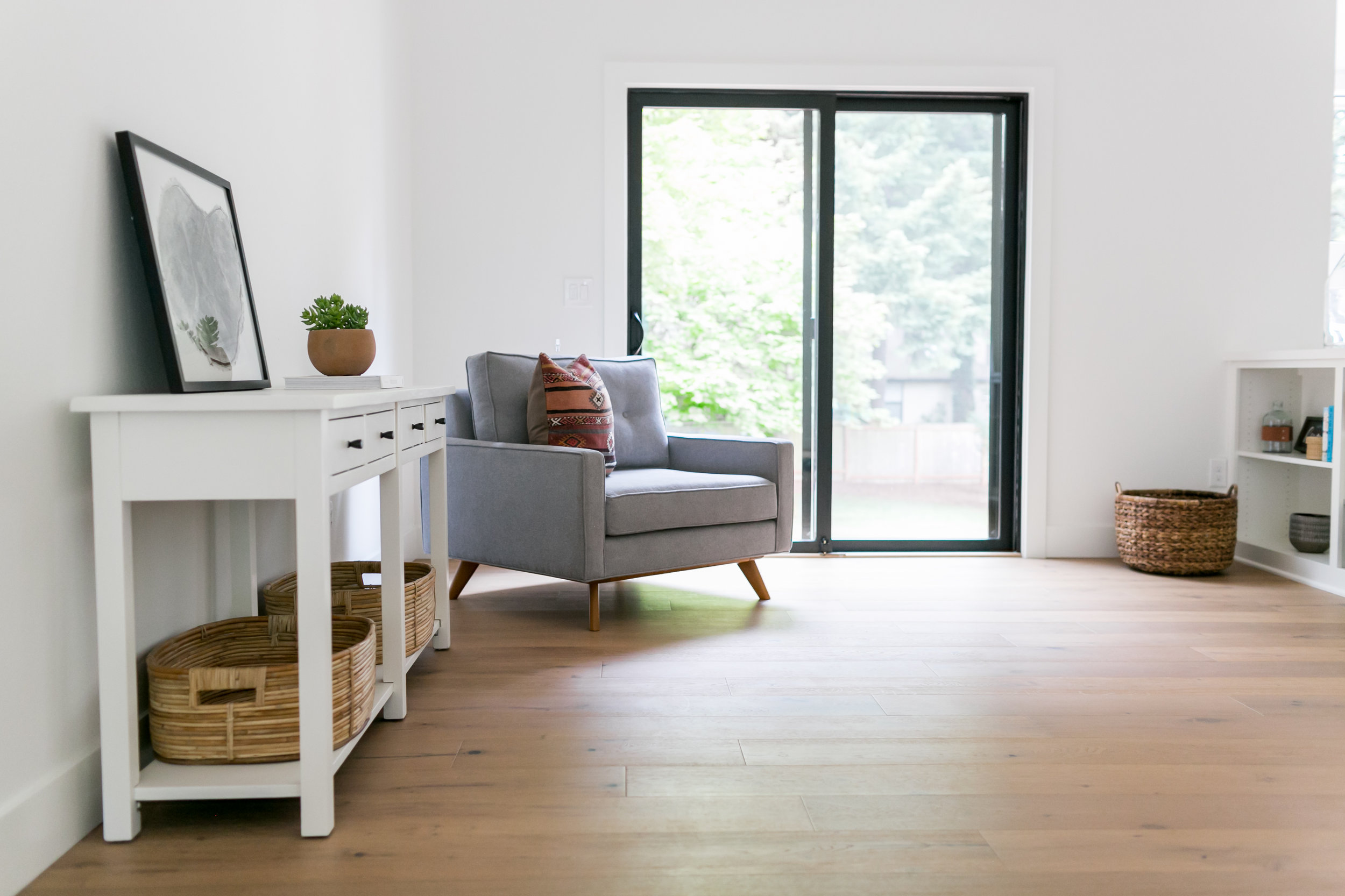
The homeowner’s biggest priorities were making modern updates and achieving an open concept.
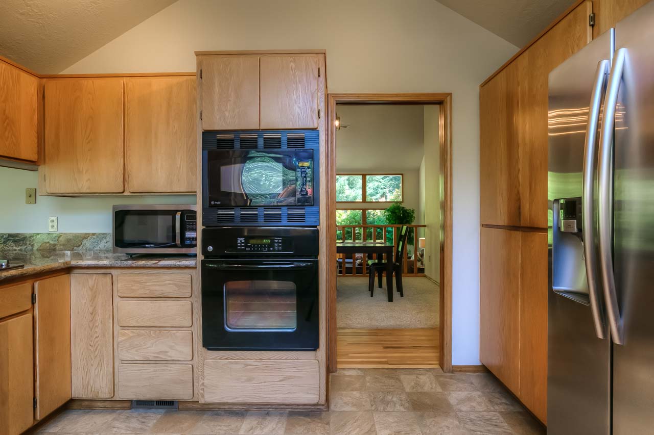
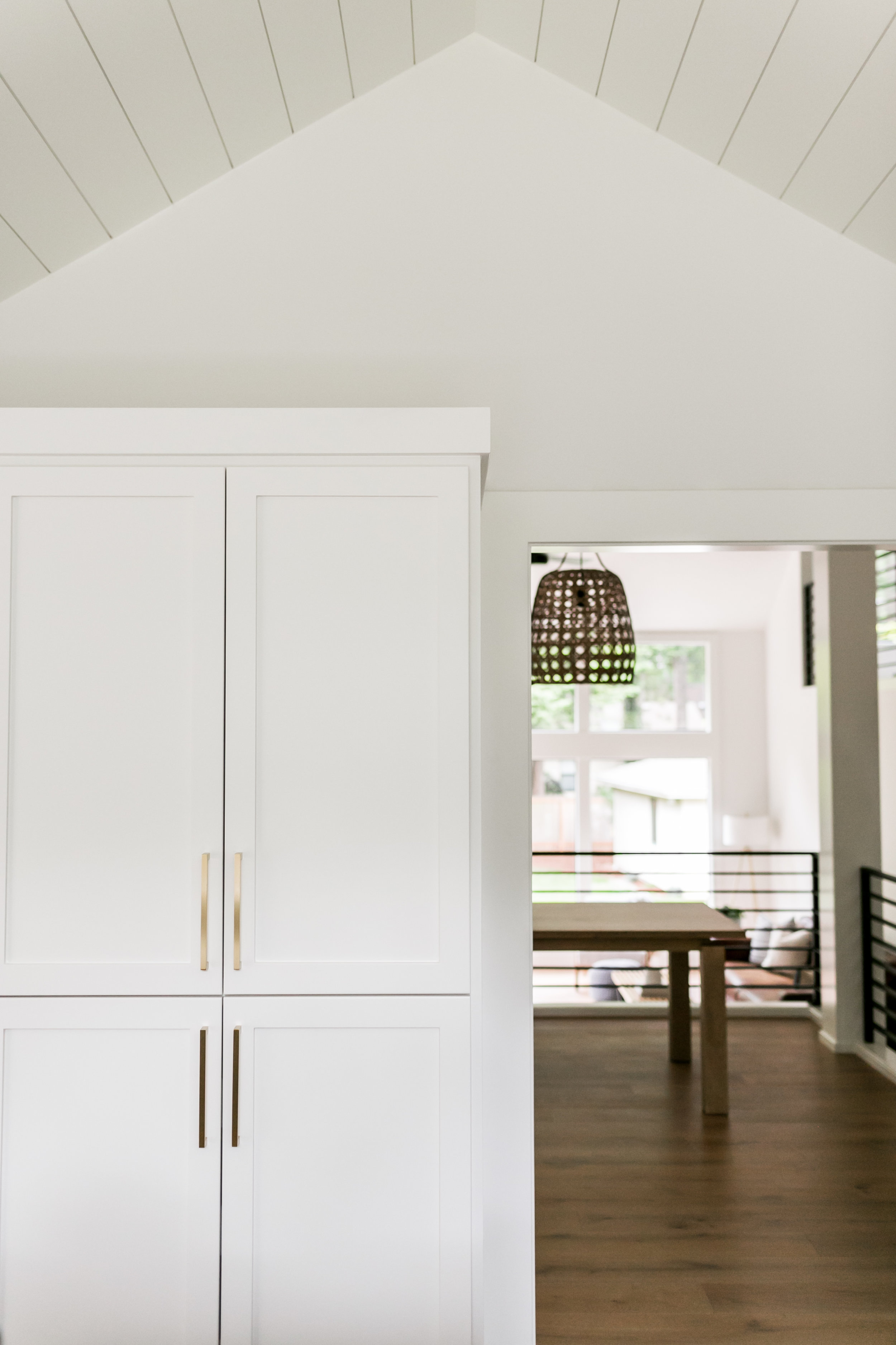
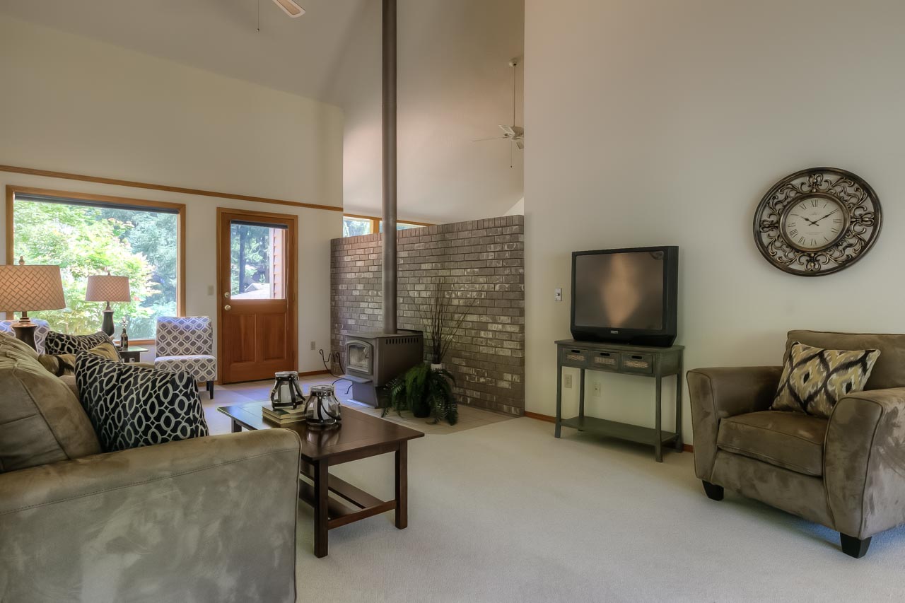
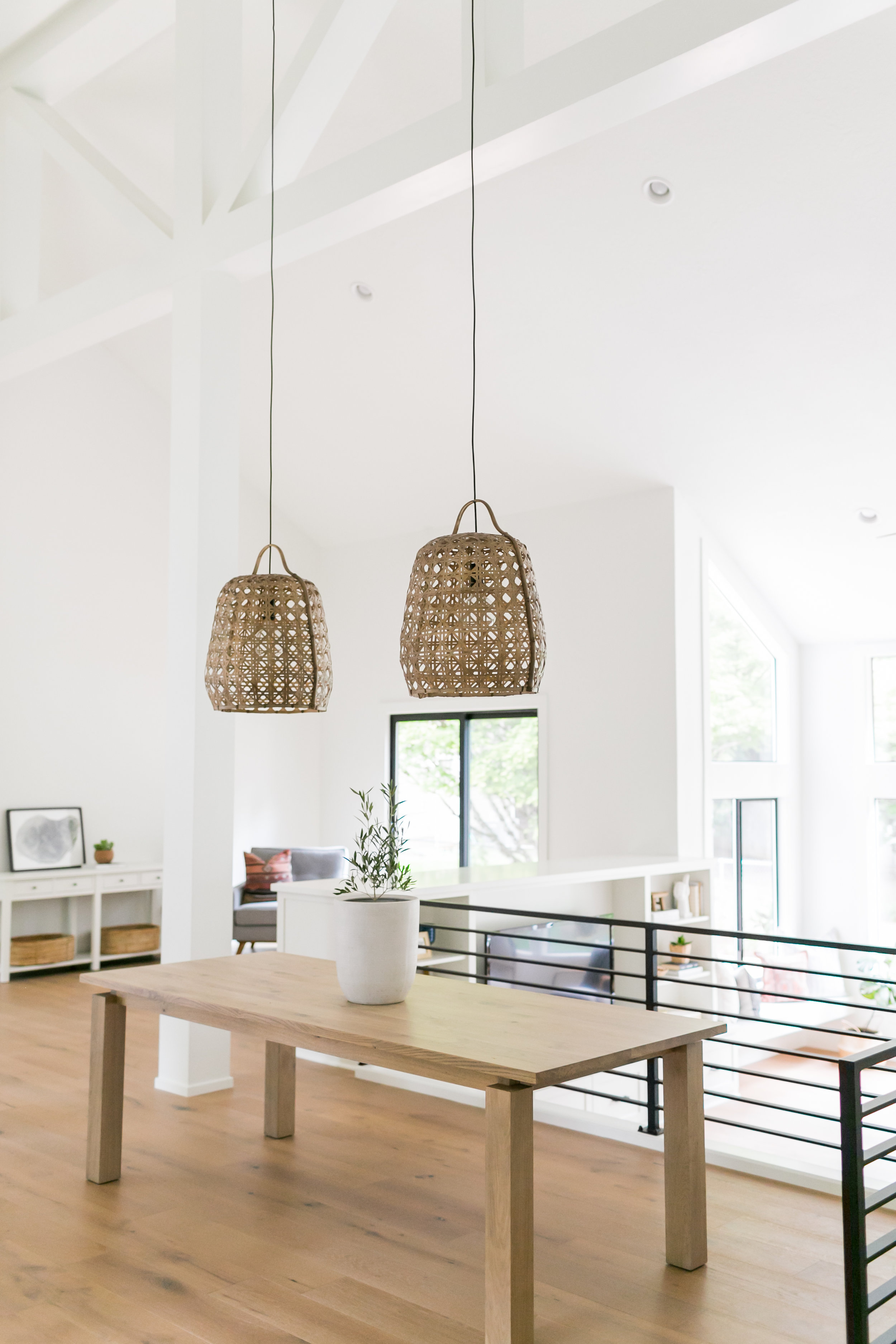
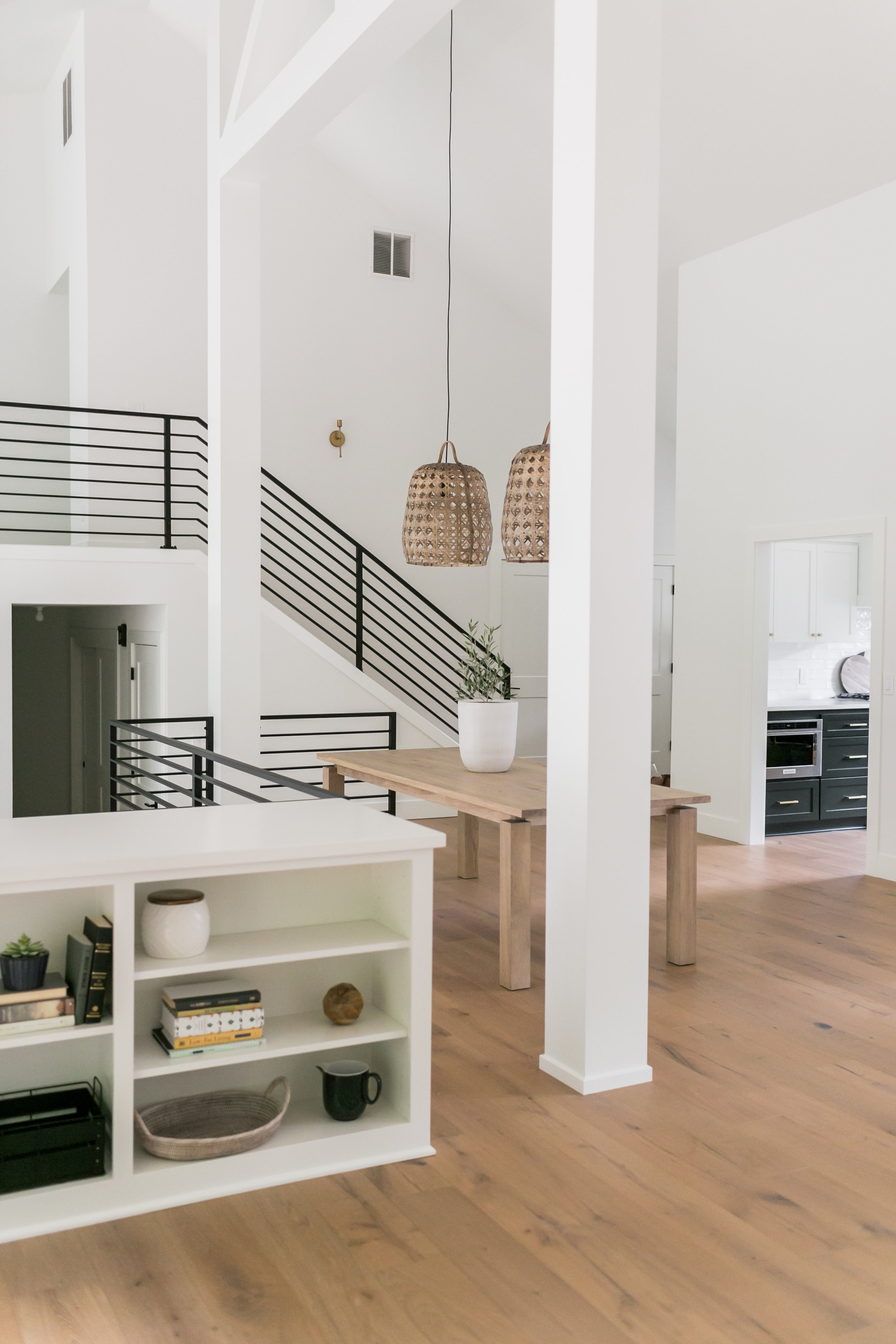
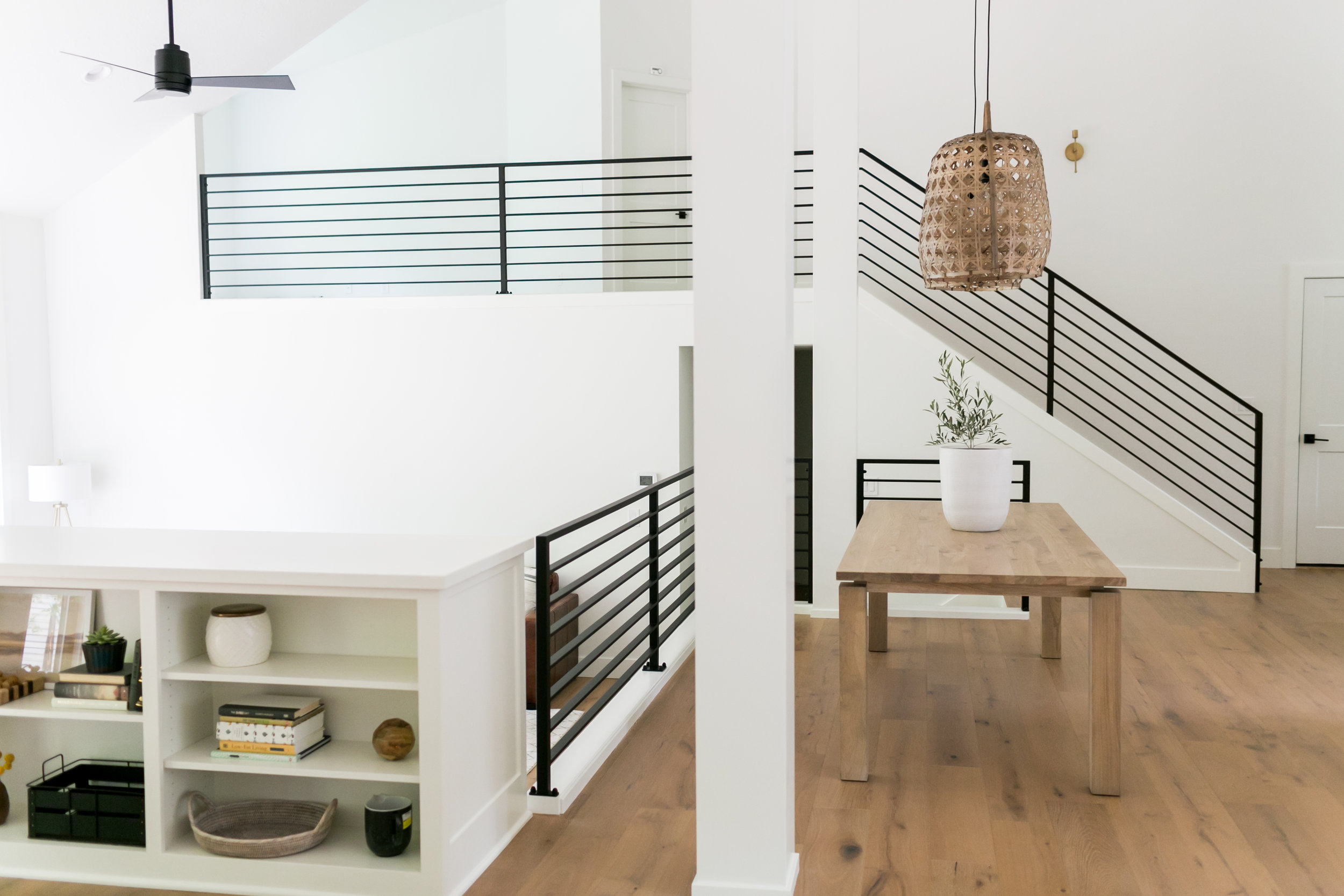
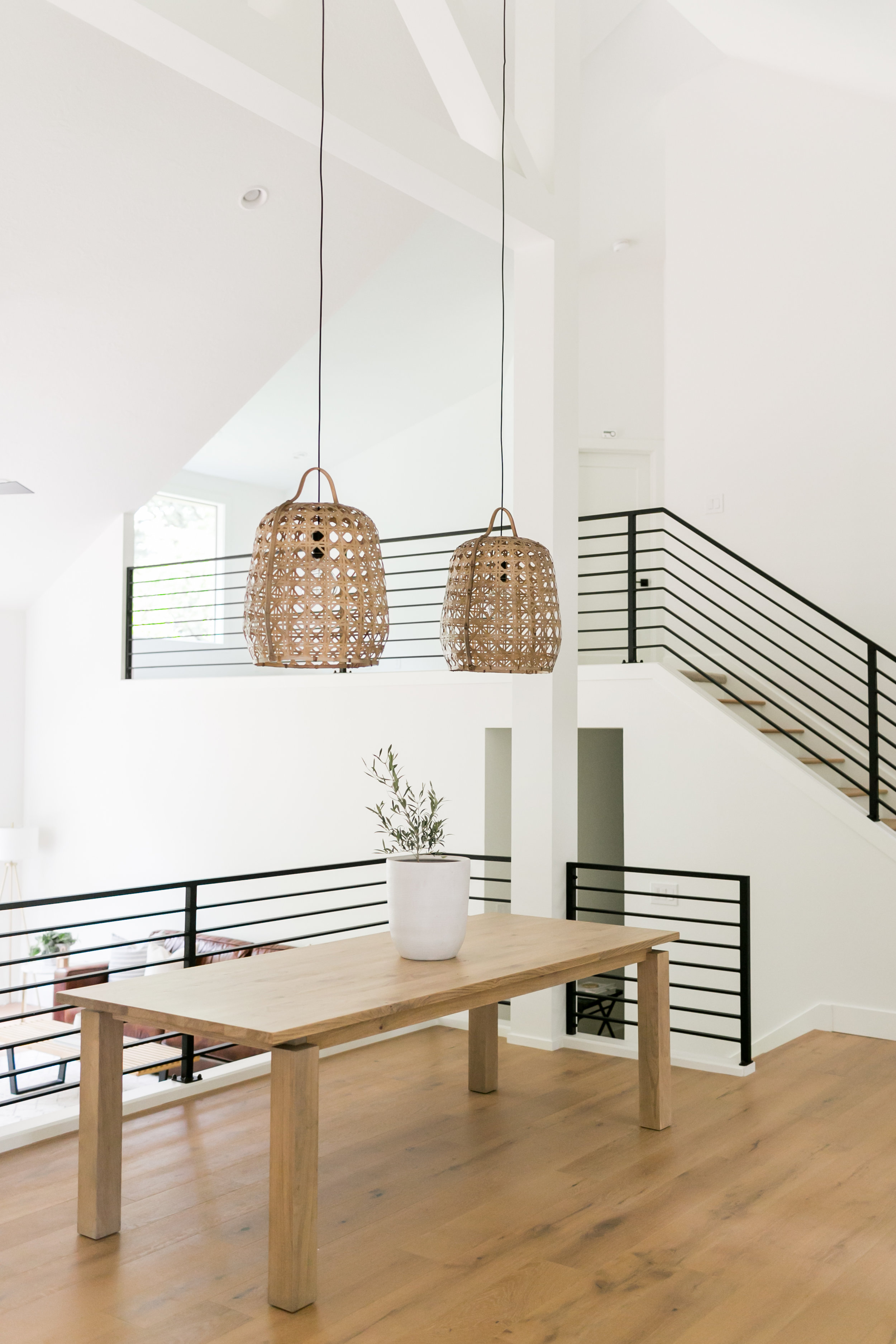
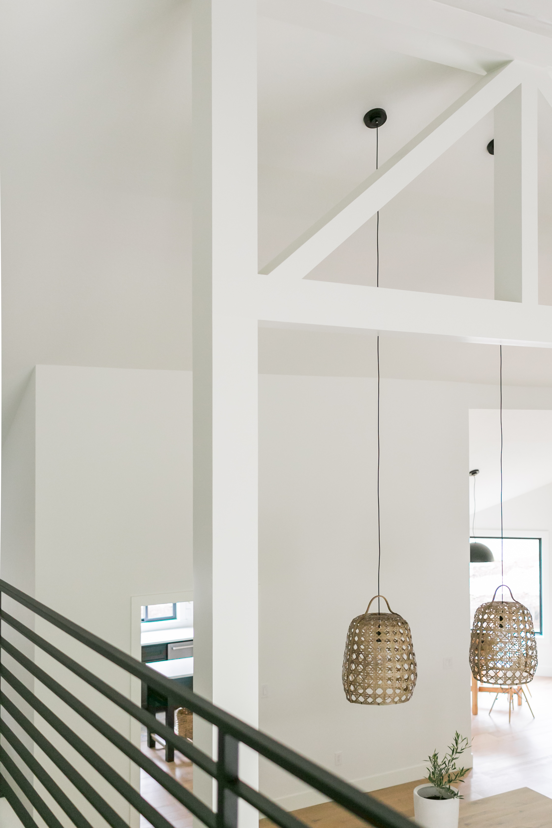
The first thing we tackled was opening up the space by removing the two walls enclosing the dining space and the brick wall. Gary and our architect found that we needed to keep two beams in this space for support so we began brainstorming on how to make this space work visually. This is where the idea of creating exposed beams was born. The exposed beam design accomplished two things; one, lowering the eye from the incredibly tall ceilings and two, tying in the two support beams to the rest of the modern design.


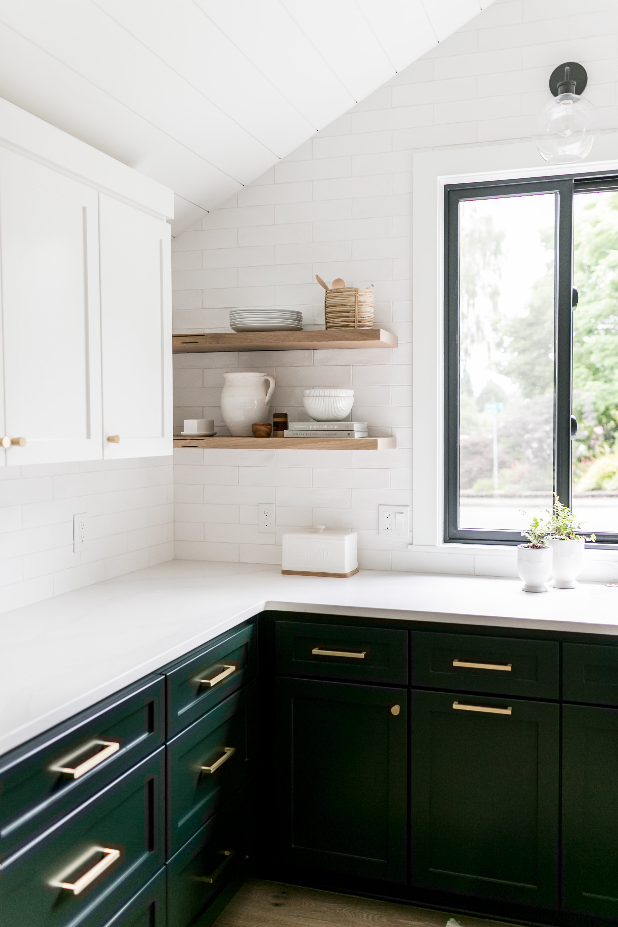
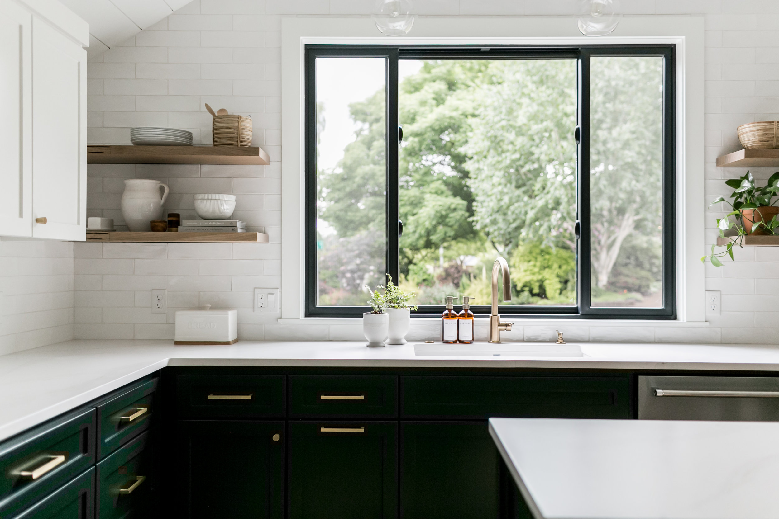
Our client loved all white everything and while we do too, we suggested a fun color for the lower cabinets so that the project did not feel sterile. We landed on Farrow & Balls Studio Green because while we wanted to add depth with the color we wanted to maintain a neutral palette. Studio green was a perfect balance as it reads almost classic black in certain lighting while also creating interest against the all-white theme. The richness of the cabinet color played very well with the projects modern vibes.
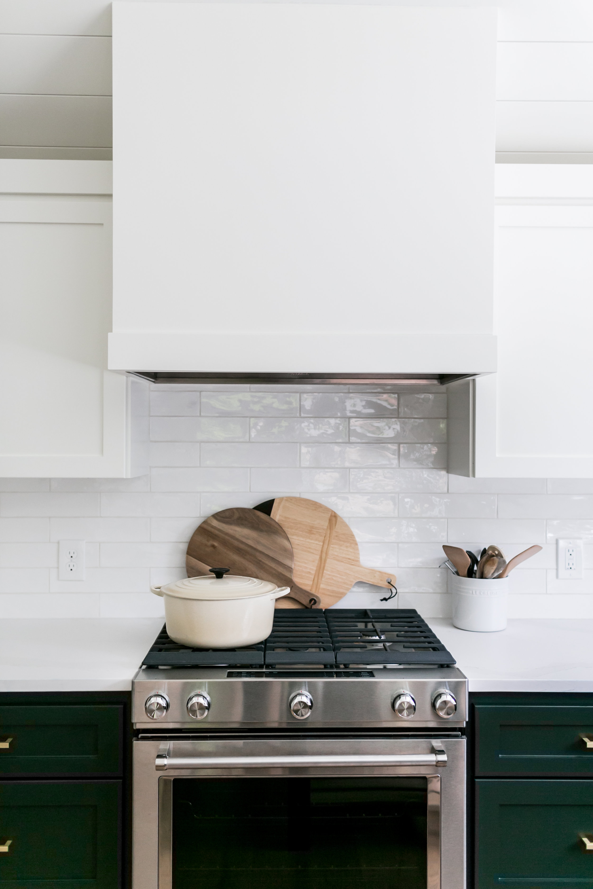
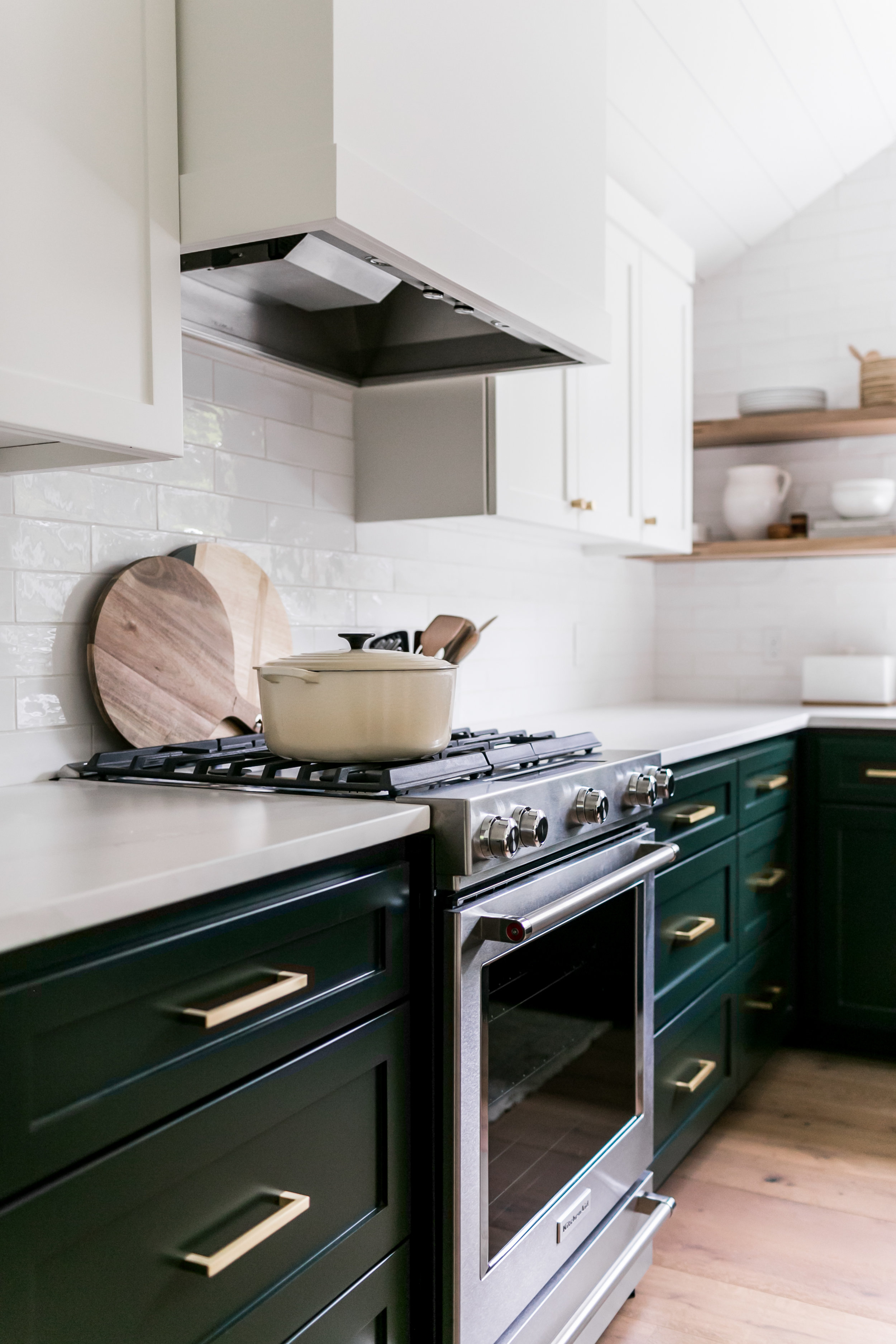
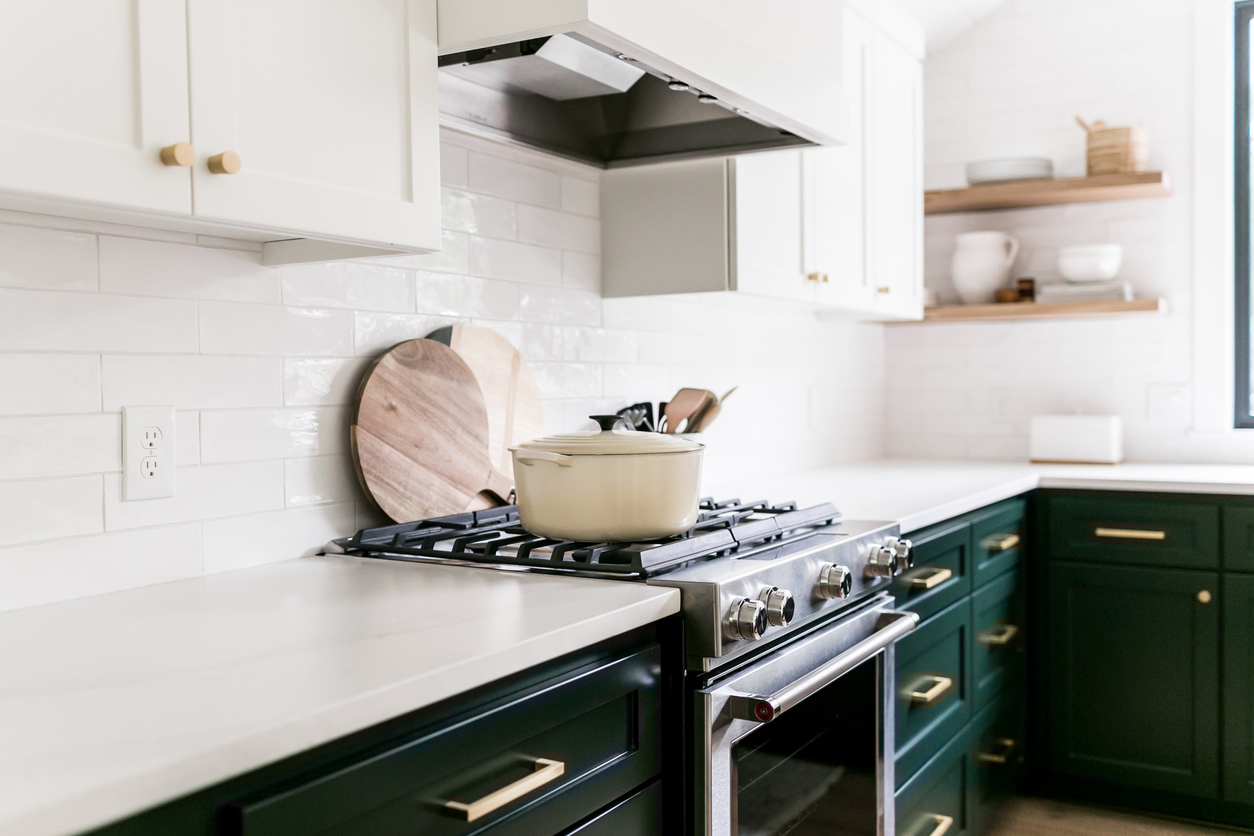

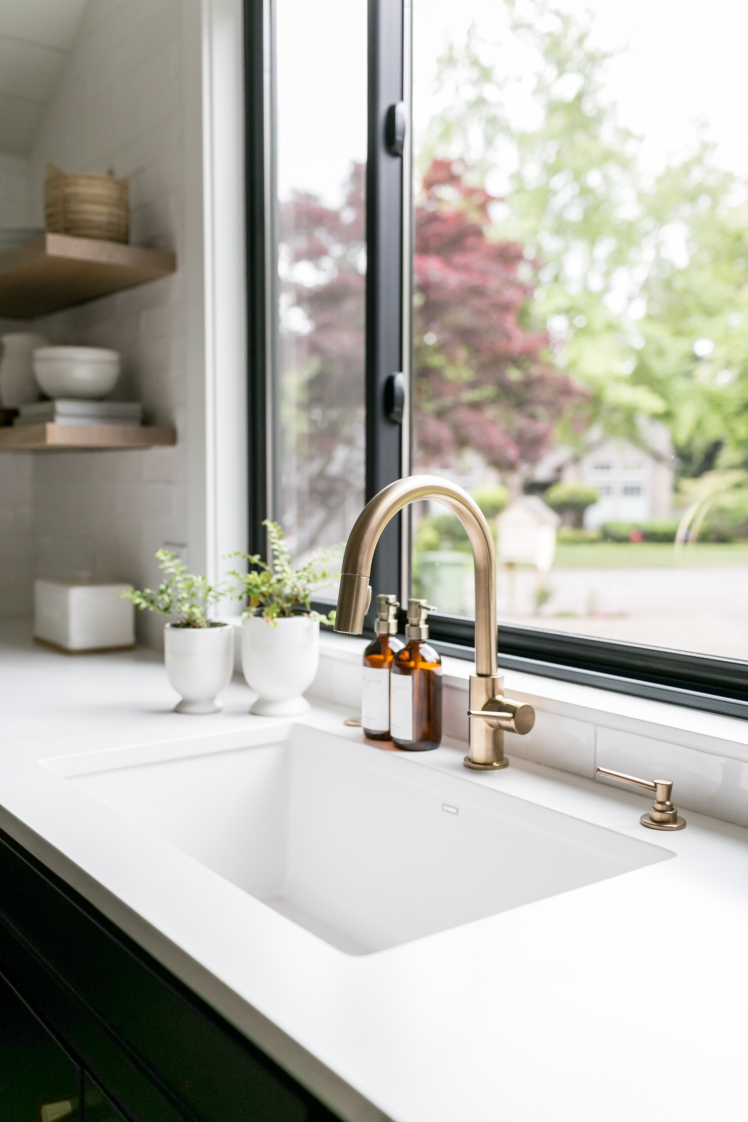
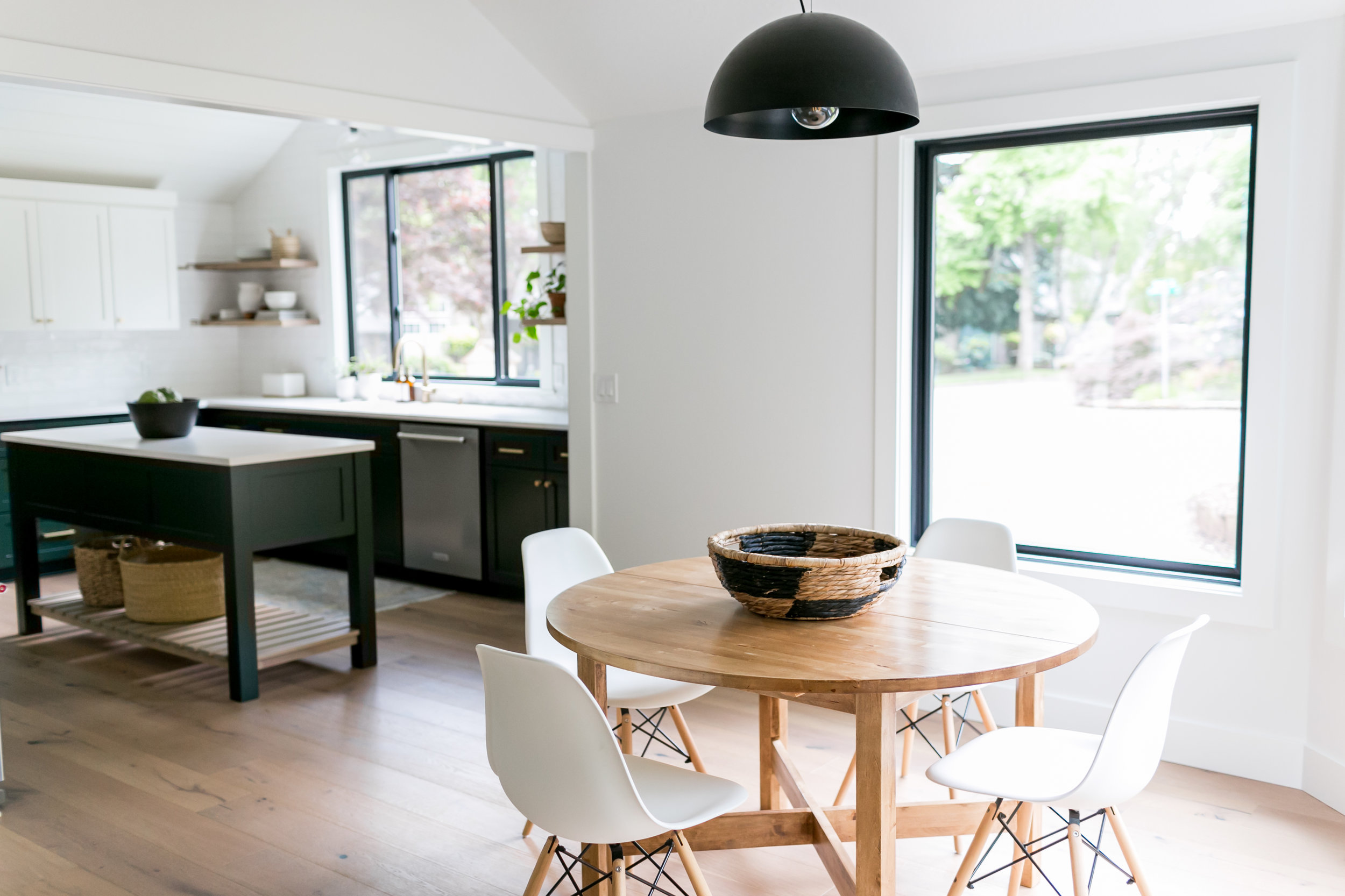
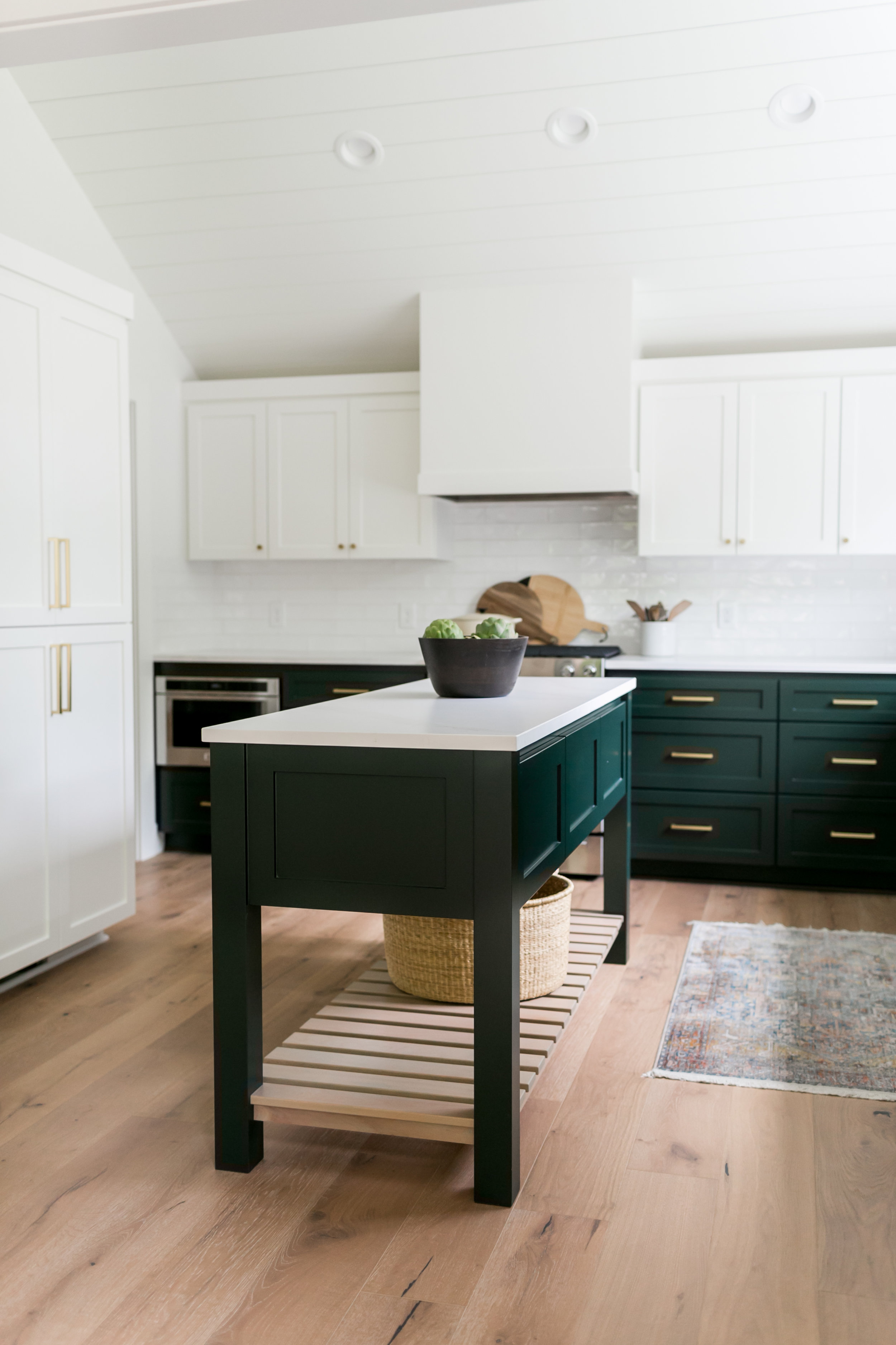

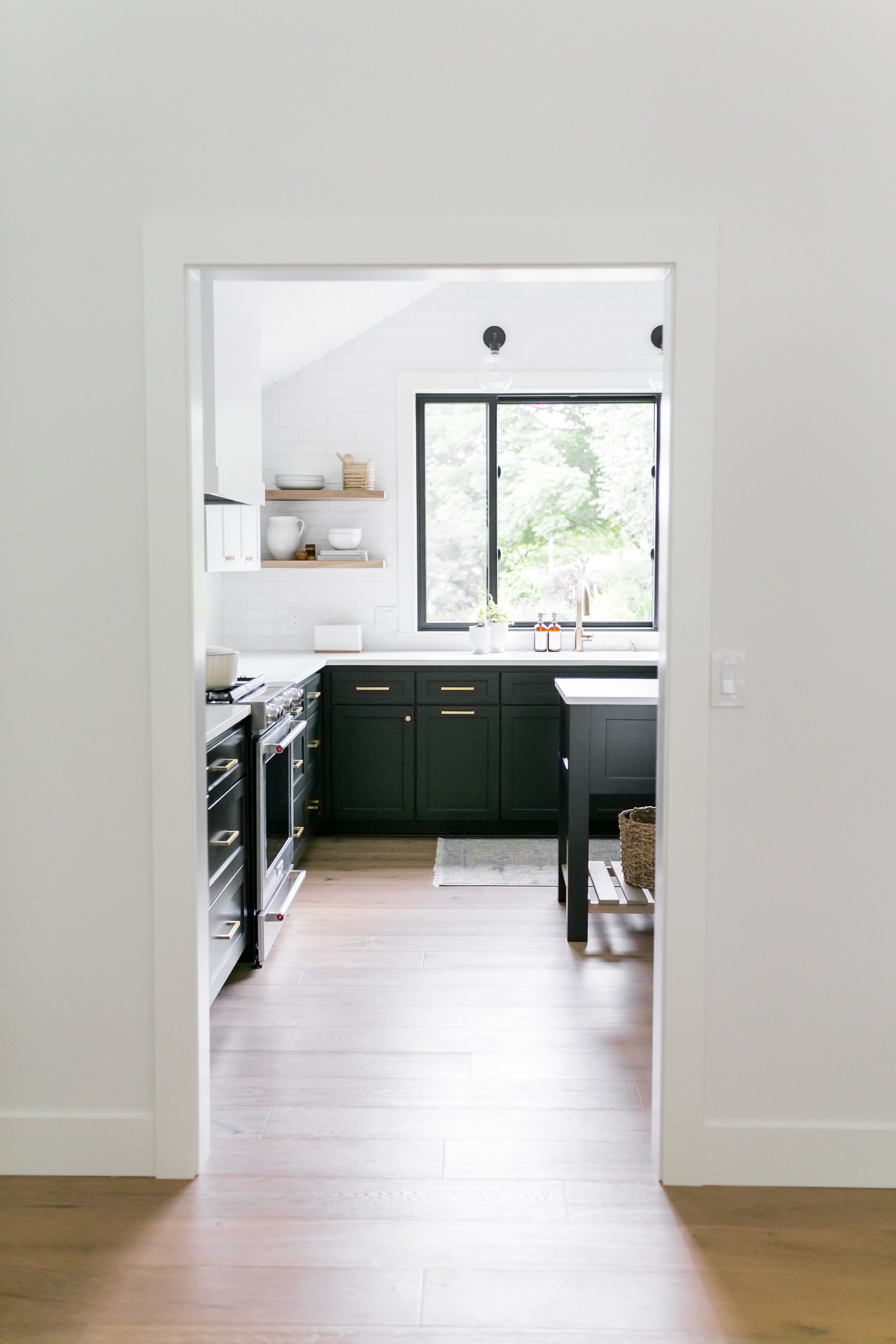
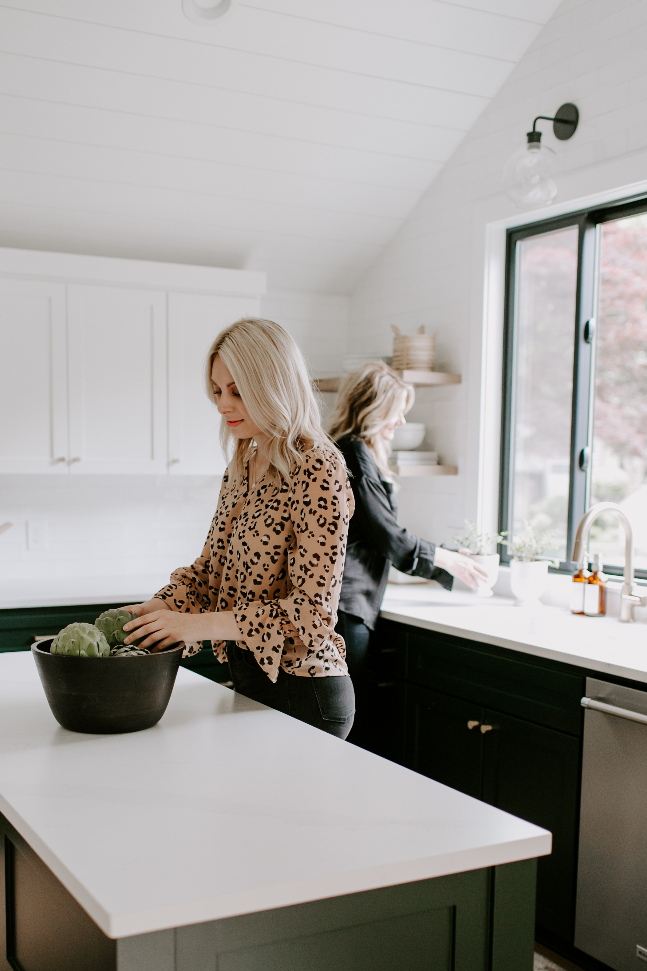
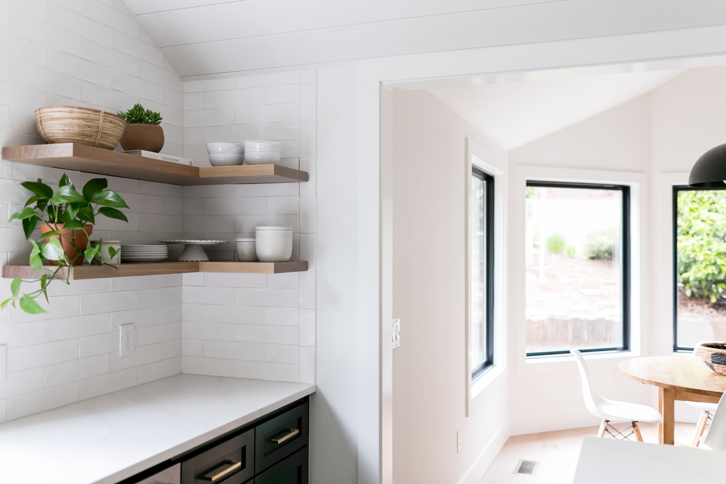
The kitchen is often referred to as the heart of the home, and in this project, we can see why! We loved that this space was filled with natural light which influenced each design component of this space. The handmade tiles that span all the way to the ceiling, white oak open shelving, clean hood and shiplap ceiling all contributed to the modern vibe. It was important for the client that the kitchen be polished yet casual. The whites where a classic design while the green provided that fun and relaxed feel.
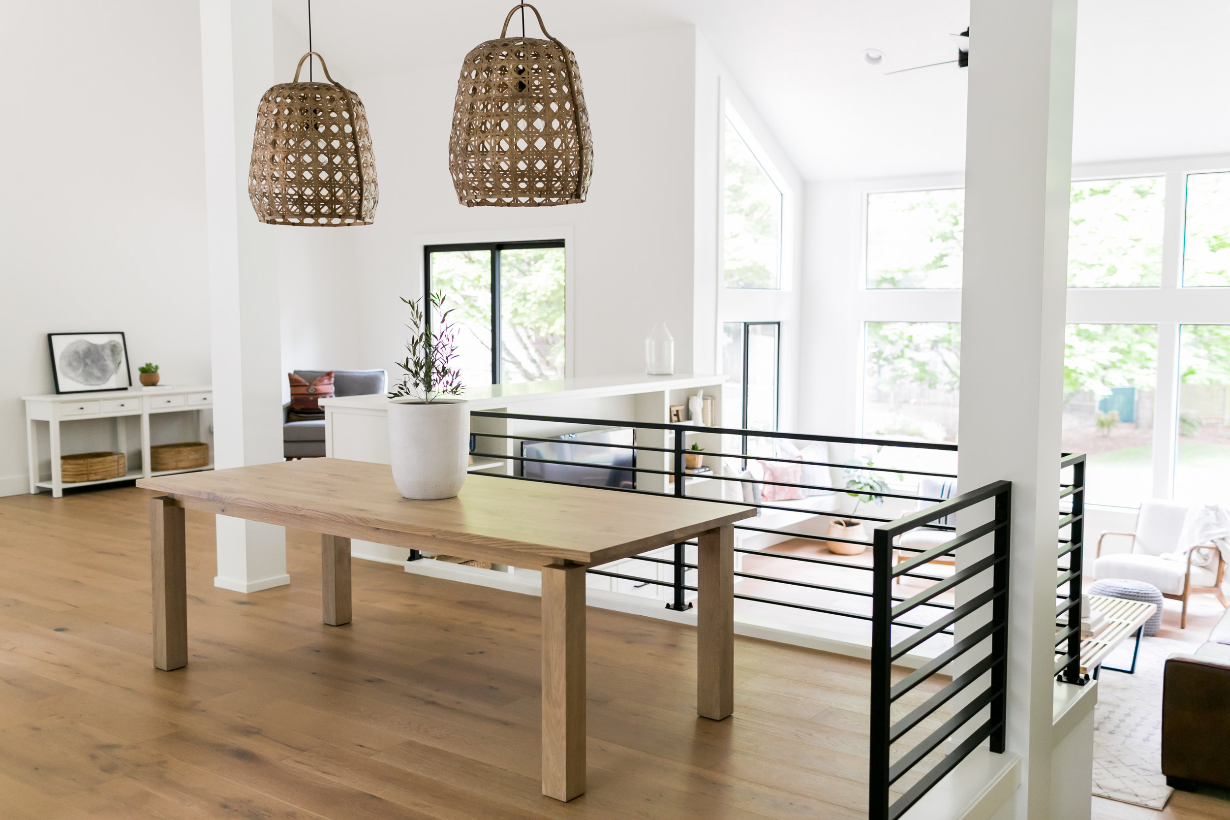
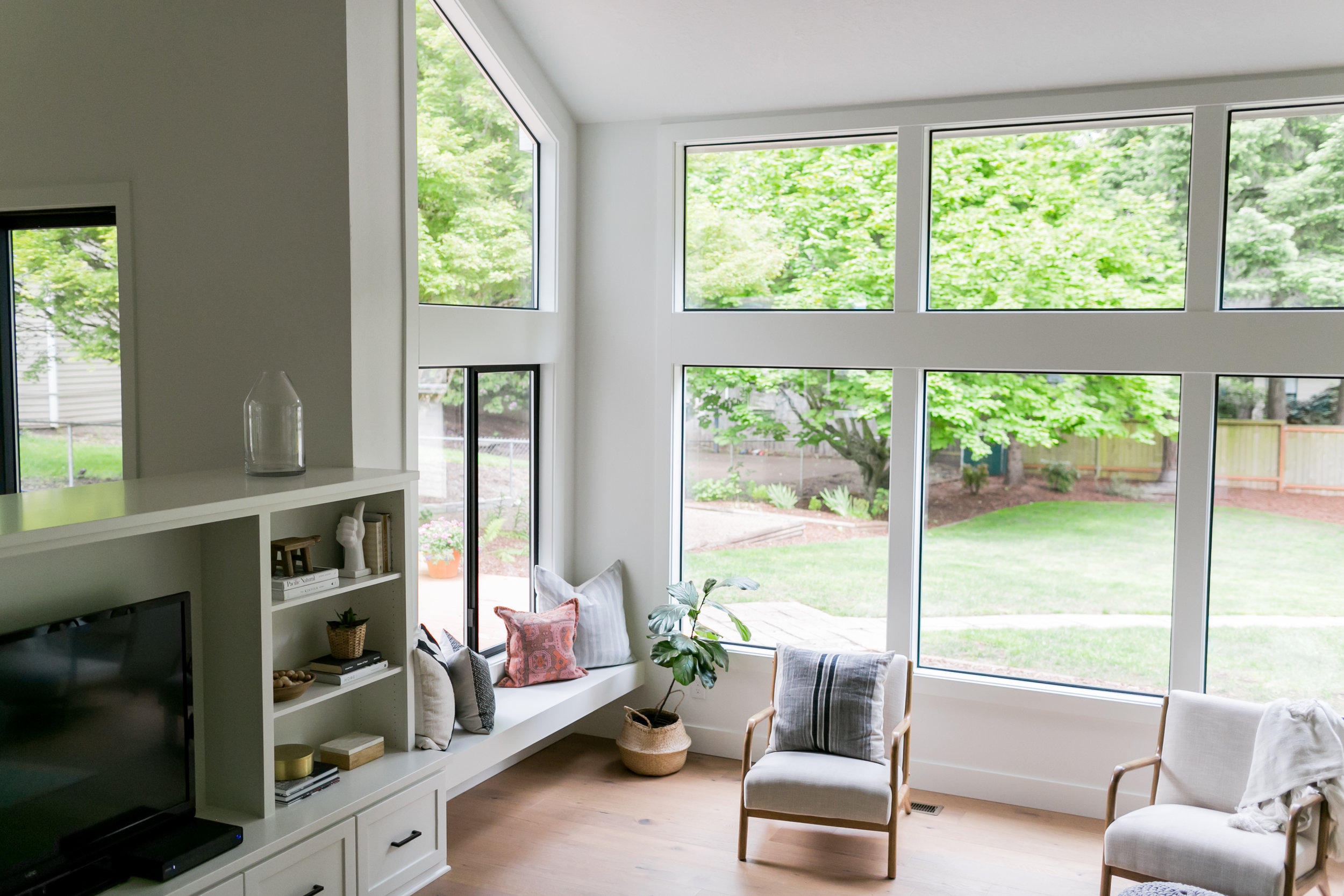
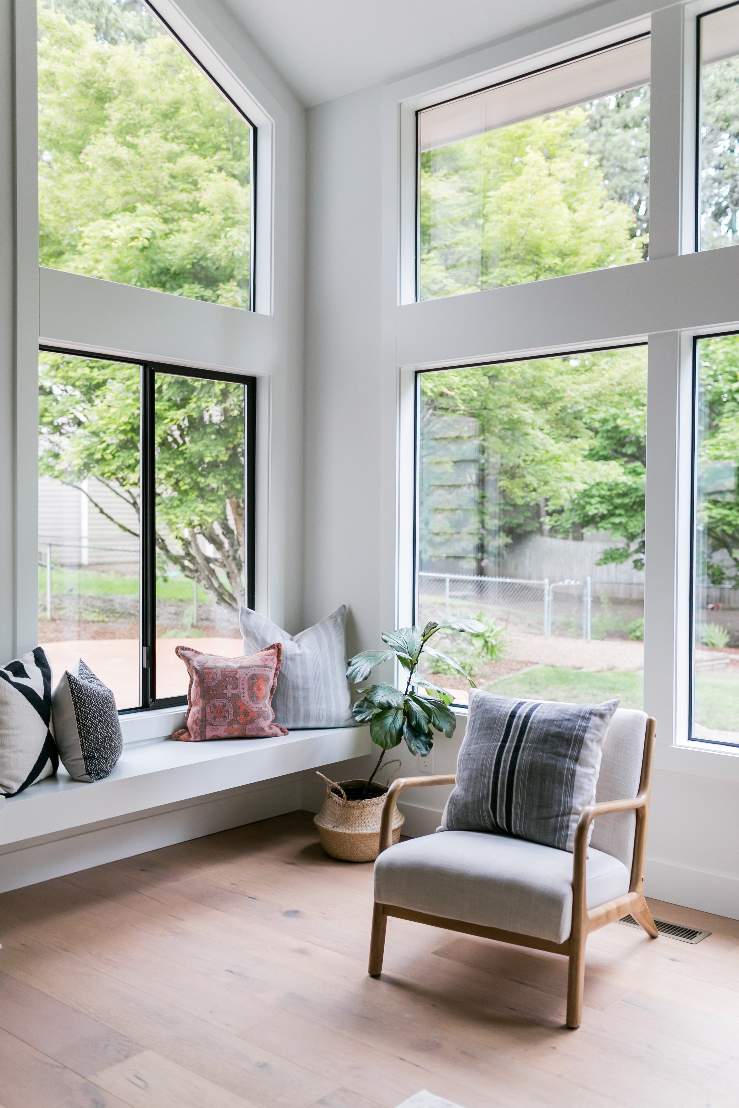
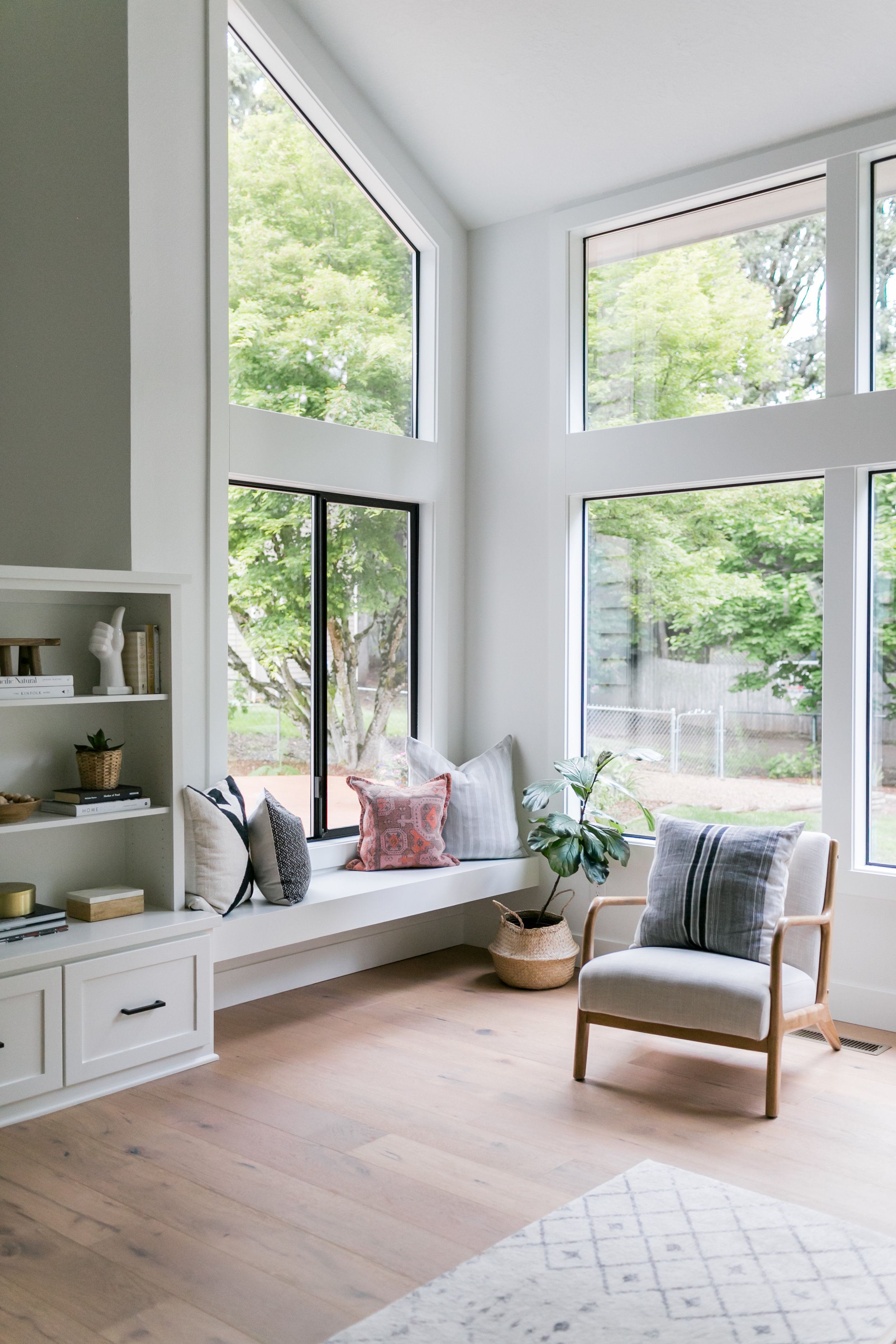
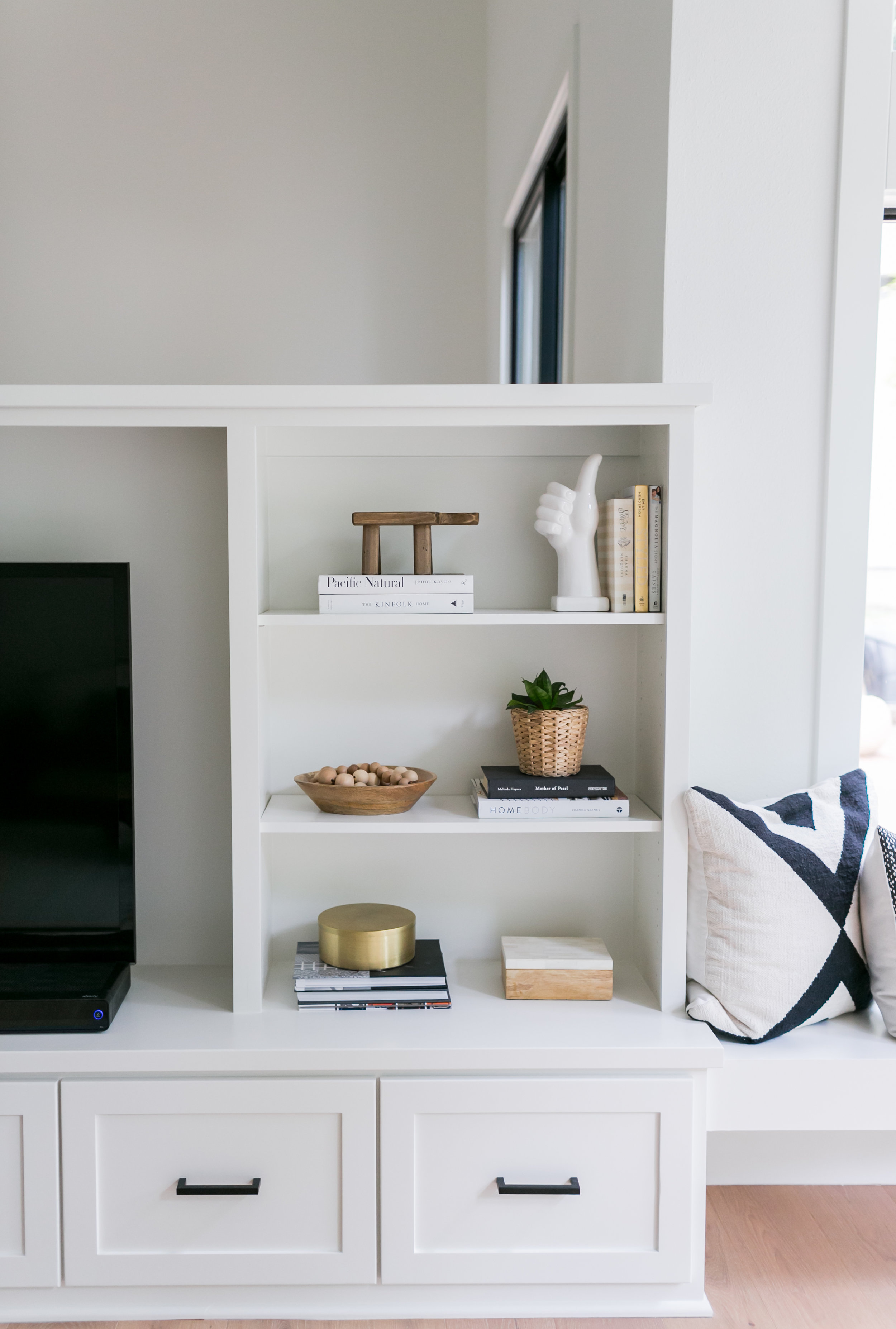
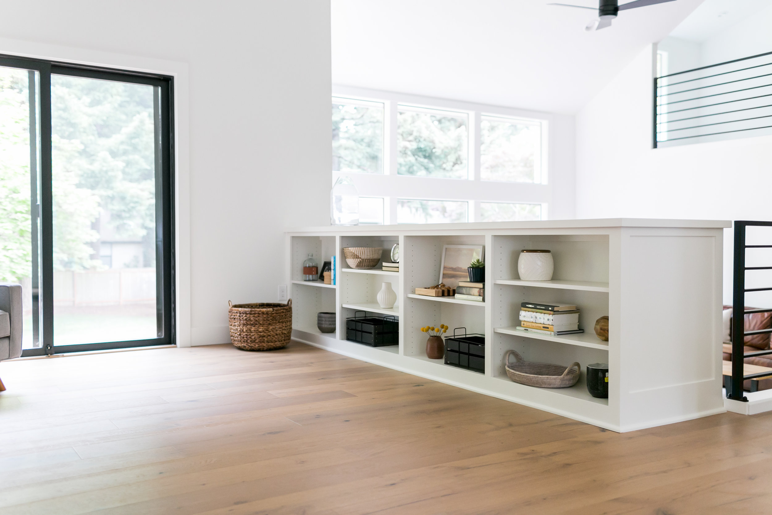
The original flooring had multiple types that ran into one another breaking up each designated space. By making the entire floor one cohesive selection we were able to tie in each area to the open concept. Another way we achieved opening up the space was knocking down the brick wall and adding in a double-sided built in which tied both spaces together. We also added this floating bench seat after we couldn’t execute the original plan of adding a door here. Often times during a project we have to go in another direction once we learn the design is no longer possible structurally but in the end it always works out for the best!
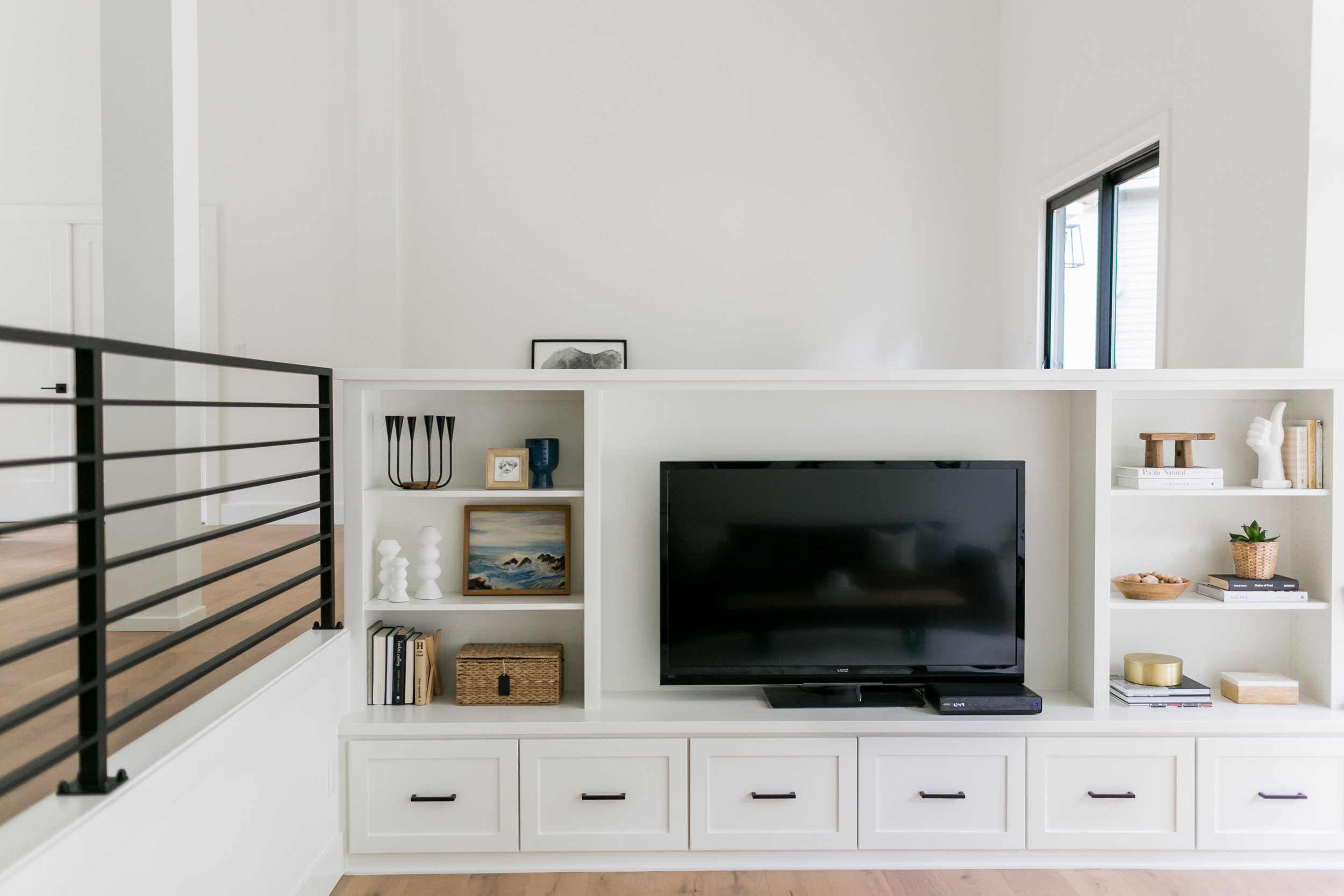
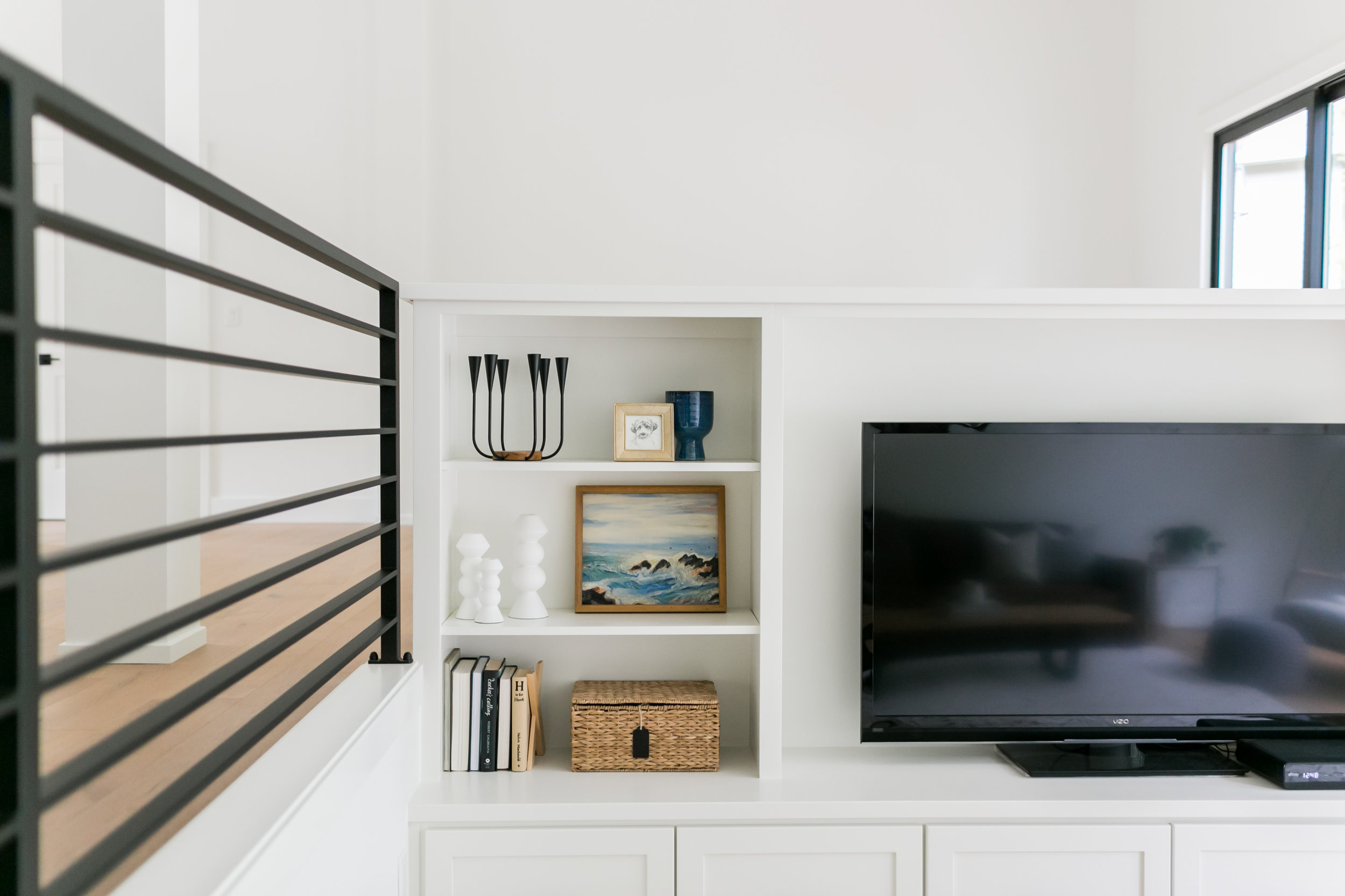
The railing was a fun project to tackle. We had the new railing custom made and because there was so much of it we designed the rails to be very thin not wanting the piece to look too bulky and overwhelm the space.


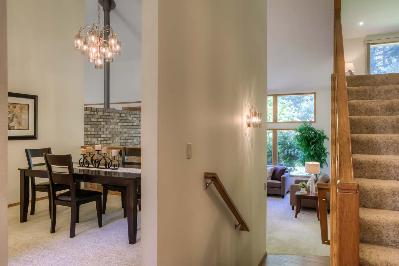
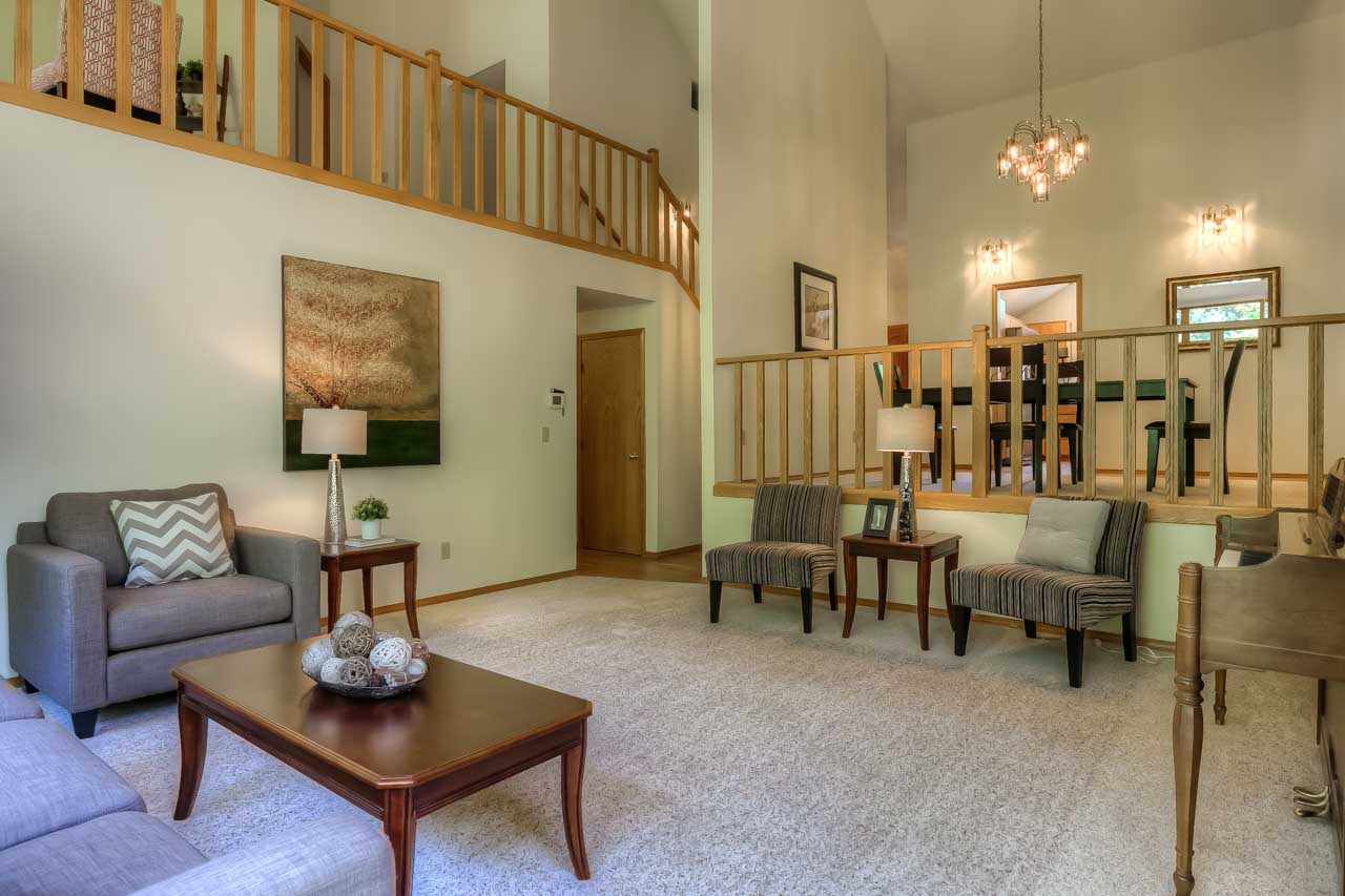
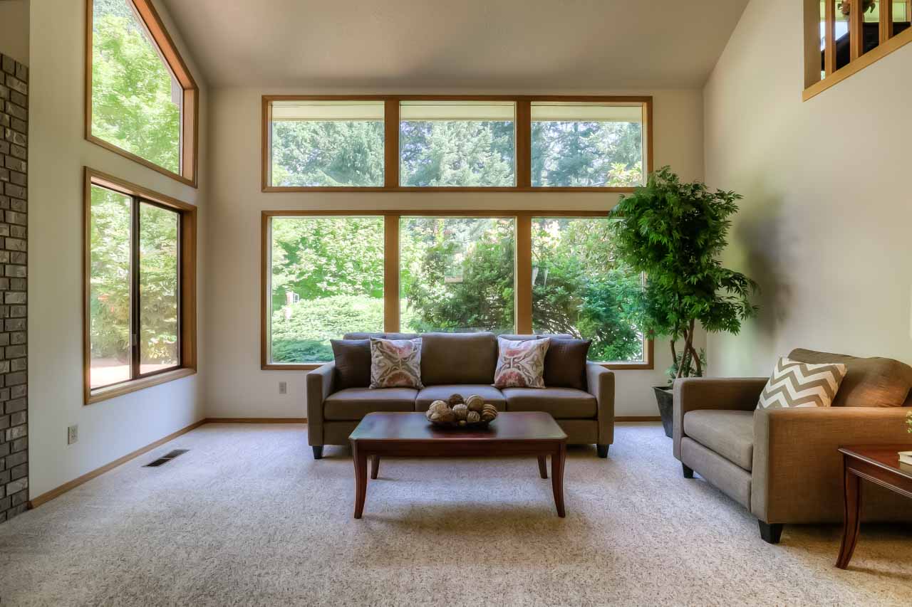
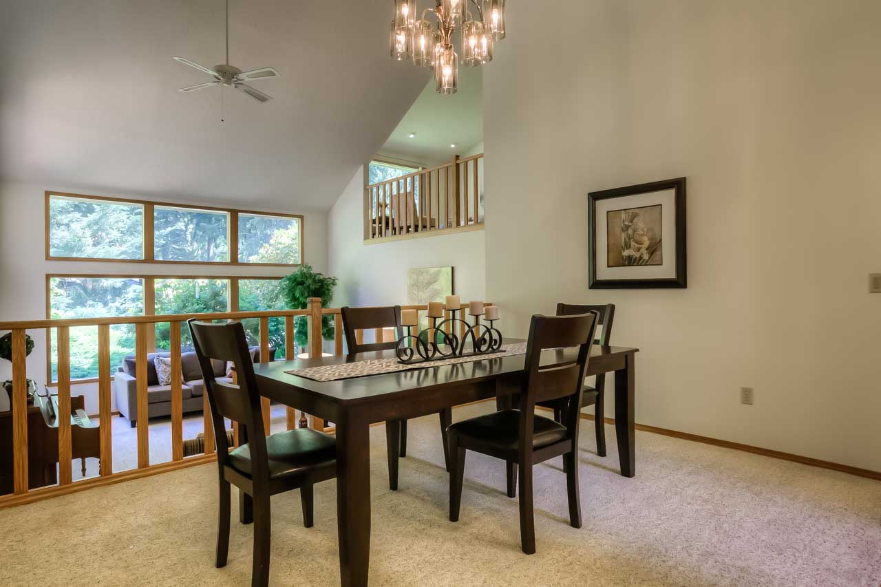
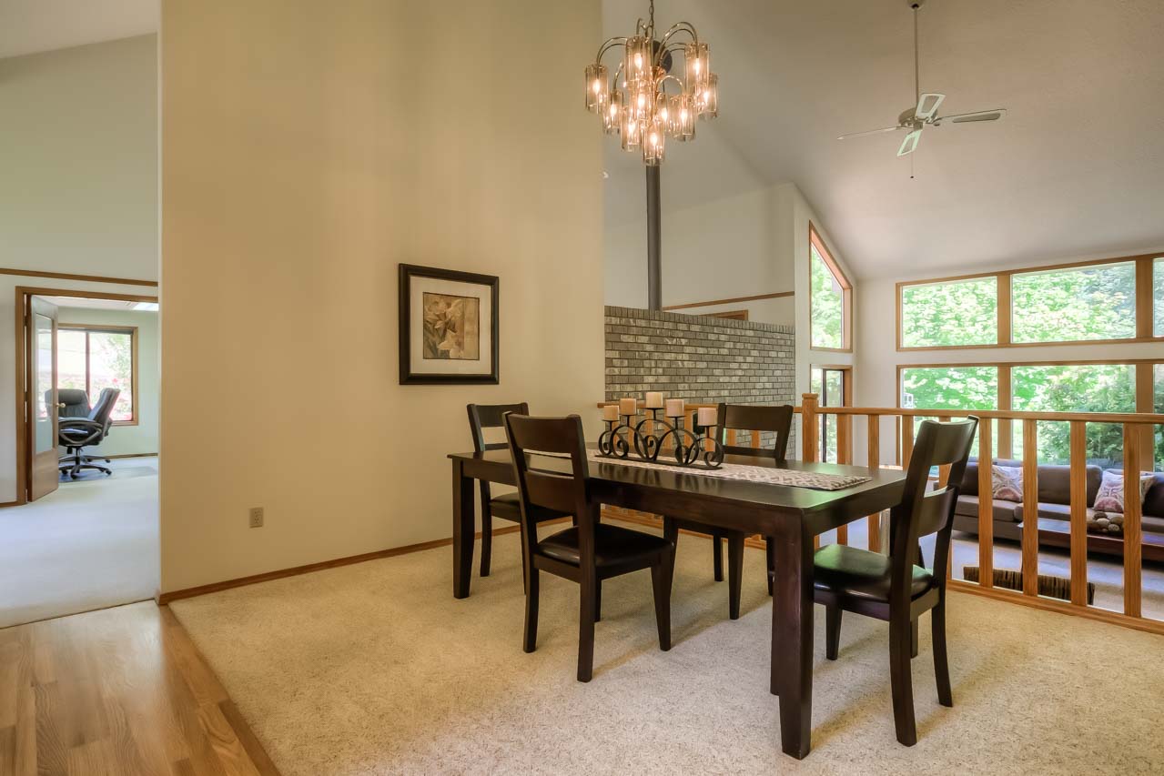
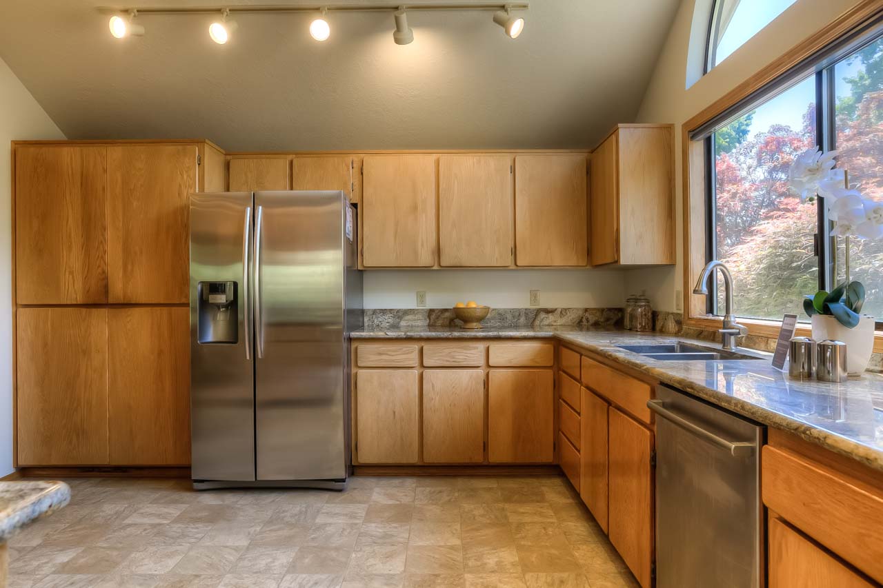
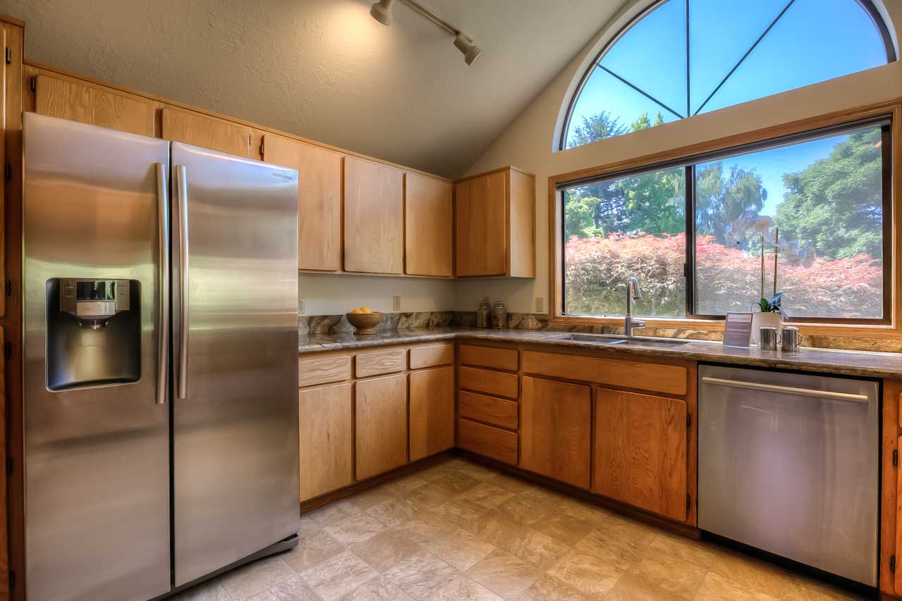
The before and after pictures are so rewarding! What a fun transformation.